This post contains spoilers for Meteorlight; if you haven’t seen it yet, or fancy watching it again, it’s available to watch on the BFI Player.)
For the short film Meteorlight (2018), our creative director Jonny (who wrote, animated and directed the film) wanted a language created that matched with the look and feel of the film. Rather than just making up random symbols, he wanted something more solid, where letters or words that appeared on screen all had structure and meaning.
Luckily, our producer Lindsey (who meddled in the production of Meteorlight), is also a published linguist. Below is her post detailing the process behind creating a language from scratch.
The idea
The characters in the Meteorlight universe don’t have mouths and don’t make any noises to communicate, so it didn’t make sense to have an alphabet based on any kind of phonology (sounds). Instead, we wanted a pictographic language, where each character represented an individual word or concept. We ended up going for language that is logographic, where each symbol represents a morpheme (a word broken up into different grammatical parts). In our case, these morphemes can often be combined to make a single symbol. For example, you can combine the morpheme that represents WORK with the morpheme that represents LOCATION into a single symbol, and this creates the word WORKPLACE or OFFICE. (More on these later.)
In terms of real languages, Chinese characters and Egyptian and Mayan hieroglyphics are similar to our system. They’re still fairly different, though; most real-world languages carry an element of phonology with them, as most communities use speech as their primary mode of communication.
When developing the basis for the language, it was important to consider how the characters see the universe and communicate with each other. Should we have something that relates to the way their ears move? To facial expressions or head tilts or arm movements? Instead, we decided on a circle as the basis for each word. The world in which Meteorlight takes place is the inside of a sphere, and there are important spheres and circles that generate the light that powers their universe.
Even though we settled on the circle, we specifically wanted two different scripts: the classical/ancient script would be based on circles, but the language used in the city and factory would be harsher, and based around hexagons. This was both to represent the dichotomy between the natural roots of the planet and the more modern industrialised dwellings, and also to add a harsh, clean, futuristic look to the text within the city. Since most of the writing we’d see in the film would be based in the city, we focused primarily on the hexagons.
So, armed with our base shapes, we started to make words.
NOUNS
We wanted nouns to be solid and concrete, as nouns themselves are self-contained objects or concepts. Nouns therefore usually have the most joined-up lines, where the hexagon/circle is closed.
The most obvious example of this is the word for LIGHT. Light is the entire basis of the Meteorlight society; they live in darkness, and the people in the city rely on the light orbs to survive. Even in the pre-industrial era, light and dark were the two main concepts. Therefore, we wanted the symbol for LIGHT to be one of the most basic ones in the lexicon:
This simple hexagon also forms an essential part of other light-related nouns. The word for LIGHT ORB, the little glowing power cells that the city society relies on, looks like this:
And the word for LIGHT SOURCE (in this case, the word used to refer to the Meteorlight character – the glowing rock creature), is this:
Other nouns generally have a closed circle/hexagon, but have a little more decoration than just the single circle. Take pronouns – we only made pronouns for first and second person, because each character will have their own logogram for their name that can in most cases be used instead of a third-person pronoun.
So, the pronouns we went with are basically WRITER (first person singular, “me”/“I”), READER (second person, “you”) and BOTH (first person plural, “we”/“us”).
First person singular is this:
The single horizontal line represents the “first” in “first person”. Also, since the script is read left-to-right (like English), the line is facing “outwards”, and so represents looking outwards from an internal position.
Second person is this:
The second person logogram looks like it’s facing the opposite way to the first person, showing that the reader is metaphorically facing the writer.
First person plural is this:

Here, first and second person are together to show a unity in writer and reader. Also it looks like they’re having a cuddle, which is nice.
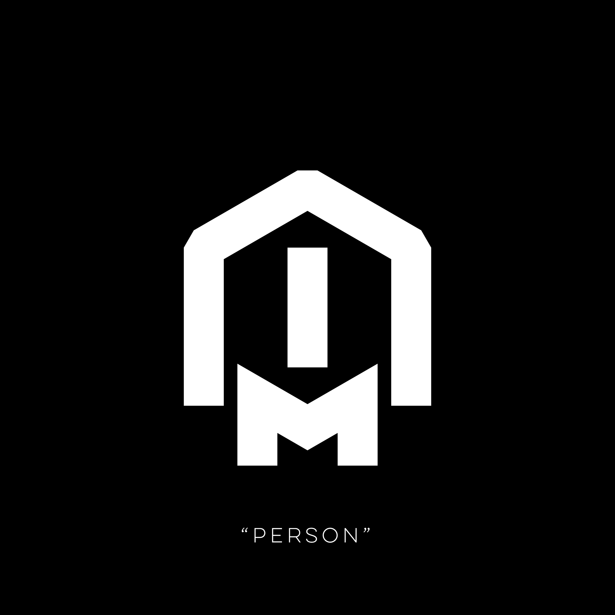
Some nouns vaguely resemble the concepts or things they represent. For example, the word for PERSON looks a bit like a person, with two arms, two legs and a body. The word for LIGHT FACTORY (the main factory where we begin the story) has lots of protruding lines to represent the series of pipes and tubes that supply the light orbs to the city. Note the single LIGHT hexagon in the middle. Different kinds of factories would have a different logogram in the centre, but the same lines around the edges

The LIGHT FACTORY noun is also used as a logo for the factory itself. It appears as such throughout the film.

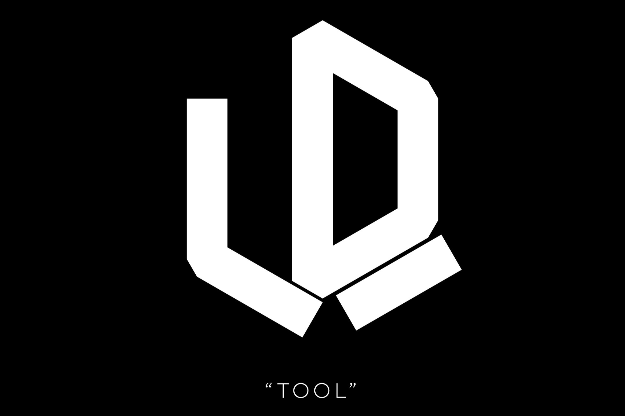
Most nouns have some kind of pictographic element, even if it’s not always immediately visually obvious. The word for TOOL, for example, shows a solid semi-circle interacting with a surface, as a physical tool might interact with the world. Similarly, the word for SALE is a mostly-enclosed circle with several horizontal lines down the right side; this represents many individual items moving onwards, or being sold. Finally, the logogram for DANGER looks like an alarm light going off.


VERBS
When it came to verbs, we were keen to show movement and motion in the way we didn’t want to show with nouns. So, while nouns were often enclosed, solid words, verbs are still based around the circle/hexagon shape, but are much more open.
The best way of demonstrating this is to show a noun and a verb side by side. Below is the word WORK, both as a noun (as in a piece of work) and as a verb.


There are several other pairs of noun/verb combinations that follow this pattern. Below is the noun for ENTRANCE. The hexagon is enclosed on five of six sides, with lines of motion representing a doorway, or entrance.
The verb for ENTER, however, is only filled in on three sides of the hexagon, though it contains most of the same strokes and patterns of lines as the noun ENTRANCE. It is this open half that better portrays the action of entering, rather than the more solid and concrete ENTRANCE.
The three-line arrow pattern in ENTER and ENTRANCE is also a verb in its own right, with the meaning of GO, or to otherwise represent movement. It appears on its own, and within other movement-related words. Here is GO:
And here is the verb EXIT:
We needed a series of verbs for buttons on the parent character’s desk. These needed to be vaguely sinister in meaning but simple in execution, and relating to the business of the light orbs and/or the Meteorlight creature. So, we came up with some simple verbs for these, each of which also visually represent their meaning. Below are CAPTURE, CONTAIN and RELEASE.


And here is RELEASE during a fairly important moment in the film:
And then we have signs for the townsfolk, telling them to DROP OFF and COLLECT their light orbs:


Even though these final two are some of the most basic verbs we have, they crucially still have three sides of the hexagon filled in, which differentiates them from…
ADJECTIVES
We wanted adjectives to be the most visually “open” of the main word classes, representing the fact that an adjective has to attach to a noun to have meaning. Therefore, while we still use the hexagon/circle shape as inspiration, we don’t actually use the shape as a basis for the word. Instead, adjectives are a basic series of lines that attach to the word it modifies. So, the adjective for HAPPY or FORTUNATE is this:
But to portray the idea of a HAPPY PERSON, the phrase would look like this:
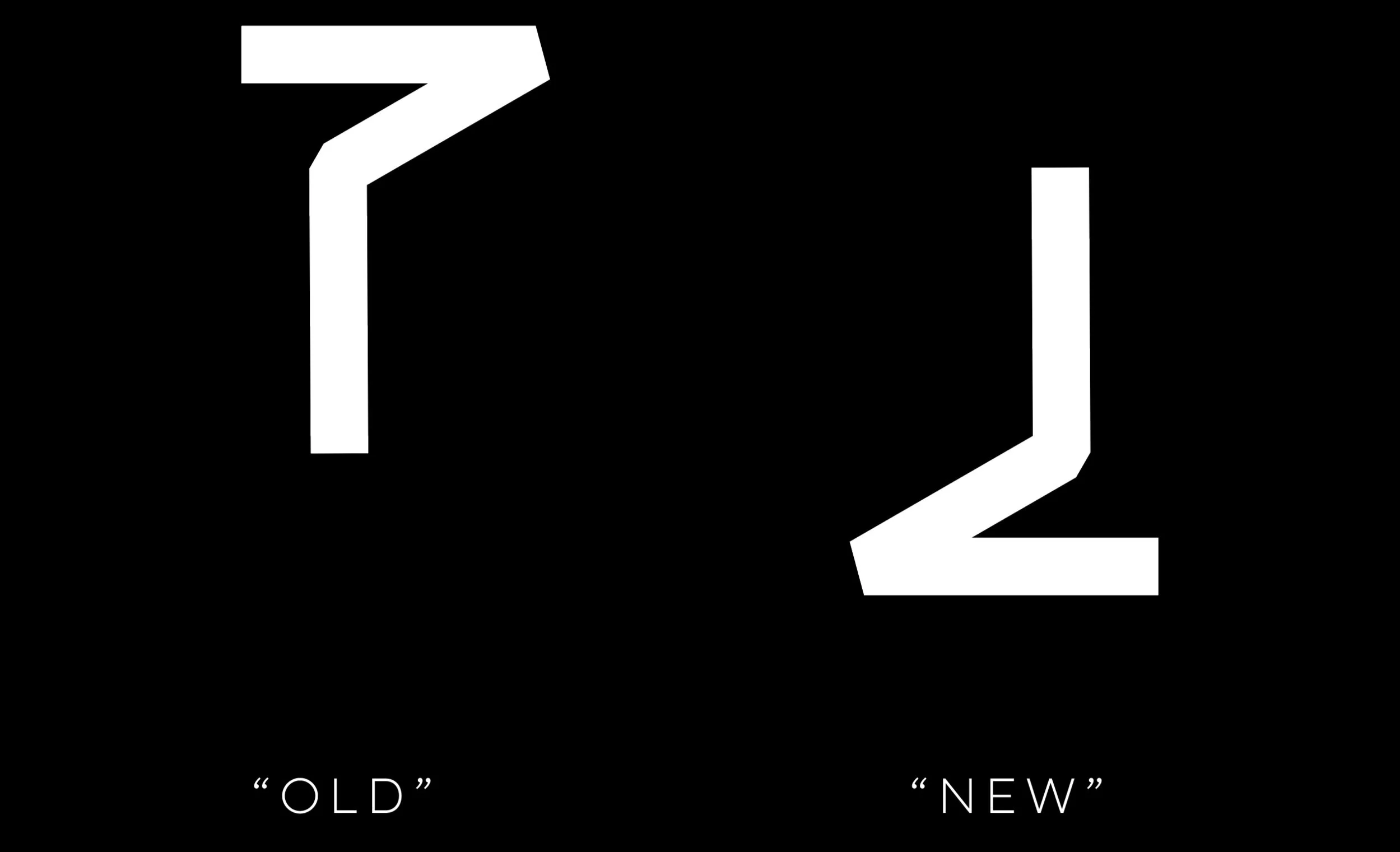
To represent the concepts of OLD and NEW, we use the same shape. But, depending on meaning, it appears on different sides of the noun. OLD appears to the left, representing the past, and NEW appears on the right, representing the future.
Therefore, the word for NEW LIGHT ORB would be:
GRAMMATICAL MARKERS
We really wanted to have a language based on simple building blocks that could be made into complex concepts. So, as with the adjectives adding onto nouns, we wanted to introduce a locative marker that could do the same thing. This would show that the word was referring to a specific place, rather than an item or concept.
So, the word for SALE, as shown above in the nouns section, is a self-contained hexagon with horizontal lines replacing the rightmost edge. But, with a locative marker, which we decided would be a double circumflex that almost looks like a roof, the noun SALE becomes SHOP.
This works for a lot of nouns. As mentioned earlier, the noun WORK with a locative marker becomes WORKPLACE or OFFICE.
We also made a word for HOME, which shows a dot inside a protective casing, representing being housed and protected. Not sure what the noun would be without the locative marker – LIFE maybe? Is the literal translation of HOME “LIFE PLACE”? Is it one of those words that just doesn’t work without the locative? Who knows. Either way, here it is:
The HOME symbol appears on the outside of the tower where the two main characters live.
We also wanted a negative marker to work with adjectives and verbs. We based this off the negative marker in the field of logic (¬) and, as in logic, it goes on the left side of the word or phrase to negate the meaning.
So, it can be used to make phrases like NO EXIT:
Or it can be used in more complex phrases, like SHOP IS CLOSED (literally here we have “NOT OPEN SALE LOCATION”):
And if, for example, a shop wanted to invite customers inside, they might have a sign containing the following sentence:
NUMBERS
Finally, numbers. To make the numerical system, we again took inspiration from Chinese, where the first three numbers are based around how many strokes it takes to write them.

So, allowing for our circular/hexagon system, our ONE, TWO and THREE are pretty similar visually to the Chinese numerals:
We also didn’t want to use a straight decimal system. The Meteorlight characters don’t have ten fingers/toes, so we wanted to do something a little different – we settled on having eight as the base number, as it’s a nice rounded number (2×2×2), and if it’s good enough for the binary system, it’s good enough for us.
So, we came up with eight different numerals for the digits 1–8:
We were keen to keep the building-block nature of the language, though, and we didn’t just want to keep making different original logograms to represent numerals until death. So, as when writing western numbers, in the teens we stick a 1 at the front of numbers to represent “add ten”, with our system you also add a 1 to show “add 8” (with 9 stacked differently just for aesthetics):

Once you get to 16, you need to add more 8s, which you do by having the number on the top right be the number of 8s you need to add. So, 17 is made up of the number 1, plus two 8s. 24 is 8, plus two 8s.
Then when you’ve got to 9×8 and have run out of space to keep notching up the “teen” number, you just keep adding onto the top right corner.
This new added number on the top right works the same as the other top-right numbers. So, 72 is 8, plus eight 8s. 73 is 1, plus eight 8s, plus one 8.
This keeps repeating ad infinitum:
Creating a language from scratch really forced us to think about the universe in which Meteorlight is set. Before we could even start coming up with words, we had to consider the history of the world and what’s important to the people who live in it. It also just made sense – since the film has no dialogue, the characters don’t have mouths, so they don’t communicate verbally, and those cute little arms aren’t dextrous enough to have a functioning sign language. It was a good support for creating the universe, a fun exercise in crafting a super basic grammar and lexicon, and greatly improved our grasp of the 8 times table.
Meteorlight was made as part of the BBC and the BFI’s Animation 2018 and is available to watch for free in the UK on the BFI player.