A collaborative project between Chicken Fruit and graphic designer Stuart Manning, with support from motion design company Alchemy and music by Blair Mowat.
This pitch originally started as a single image from Stuart. From there we developed the idea into two title sequences unlike anything we felt had been seen before on the show, but that also stayed rooted in that unique Doctor Who feel.
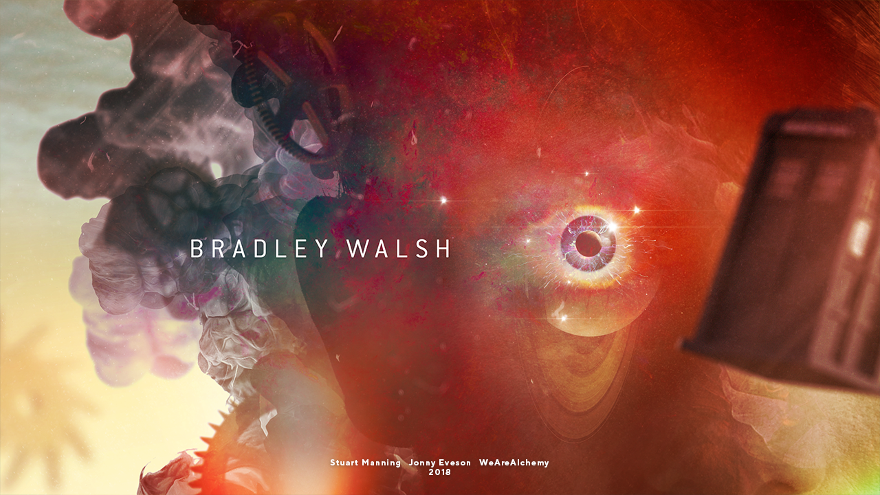
The first of our ideas was based on a series of graphic shapes which hung in space. The second was based on a nebulous cloud which would form the 13th Doctor’s face.
Route 1
Initial frame mock-up by Stuart Manning
The idea (the final version of which is shown in the video at the top of the page) was based around overlapping harsh geometric shapes with looser ink elements. The TARDIS would hurtle down a corridor made of several different shapes, each one decaying as it left the frame. The sequence would play with negative space, inverted colours, and an acidic colour palette to evoke a chaotic, mysterious feeling.
In the development process, we ended up brightening the acidic colours into more saturated palette. We wanted to make the sequence as vivid and colourful as possible; a bright, shiny new adventure for the then-new 13th Doctor.
Of our two title sequence ideas, this is the one we chose to develop fully into a final animation.
Route 2
Initial frame mock-up by Stuart Manning
This sequence starts with a murky underwater landscape. Rising up from the sand dunes are giant stone cogs. Alluding to a graveyard, this represents leaving the past behind. The future awaits on the horizon.
We really wanted to get a sense of a grand scale in this landscape, keeping the viewer unsure whether the action takes place underwater or on an alien planet. The movement of the camera, the lenses used and the speed of the objects would all help give a sense of scale.
To decide which final route to take, we developed a 3D animatic and style frames for both different title sequence ideas.
Tardis design
We wanted to use this opportunity to design what we thought our perfect TARDIS would look like. As reference, Stuart sent over two images of what he wanted to draw inspiration from.
From there, we modelled a design which incorporated the best parts of both references.
After the official reveal of the 13th Doctor's TARDIS design, we altered the design you see in the final motion test. But we still like ours better. 😉
Logo design
As with the TARDIS design, we wanted to create a new logo for the upcoming series.
We were keen to make sure that the BBC logo worked with the Doctor Who logo; usually the BBC branding feels tacked on at the very end of the design process.
We call this project a pitch, but really it was more a case of wanting to make a thing for a show we’ve consumed many, many hours of, and then sending it vaguely in the direction of production staff. Who knows if they even saw it? The Radio Times was very nice about it, and that’s much more important. Right?
CREDITS
MOTION DESIGN
Jonny Eveson
MOTION DESIGN SUPPORT
WeAreAlchemy
GRAPHIC DESIGN
Stuart manning
JODIE WHITTAKER 3D HEAD SCULPT
Gavin Rymill
ORIGINAL THEME MUSIC
Ron Grainer
THEME ARRANGEMENT
Blair Mowat


